With Halloween just around the corner, we thought we’d release something a little spookier than our usual content. Here are the Seven Deadly Sins of Web Design…
No Responsive Design
A responsive design automatically scales a website so that its content and other elements matches the screen size it is being viewed on. This is important for people visiting your site from mobile devices, like their phone or tablet.
Without a responsive design, you’ll end up with a lot of frustrated customers having to scroll, resize, zoom in or zoom out to view your content. And that’s if they stick around for long enough to buy from you.
Make your site responsive… Or risk scaring mobile device users away!
Slow Loading Sites
Aiming your site at immortal beings? We didn’t think so!
Most people won’t wait longer than a few seconds for your site to load before giving up.
There are many factors which could be contributing to your site’s slow speed. These include resource-hogging plugins, oversized and unnecessary files, unclean code and bad hosting.
Some site performance issues are simple to fix. But you may need the help of an experienced professional to manage the more complicated ones.
Time is precious for us mortals… Don’t waste our time with a site which takes centuries to load!

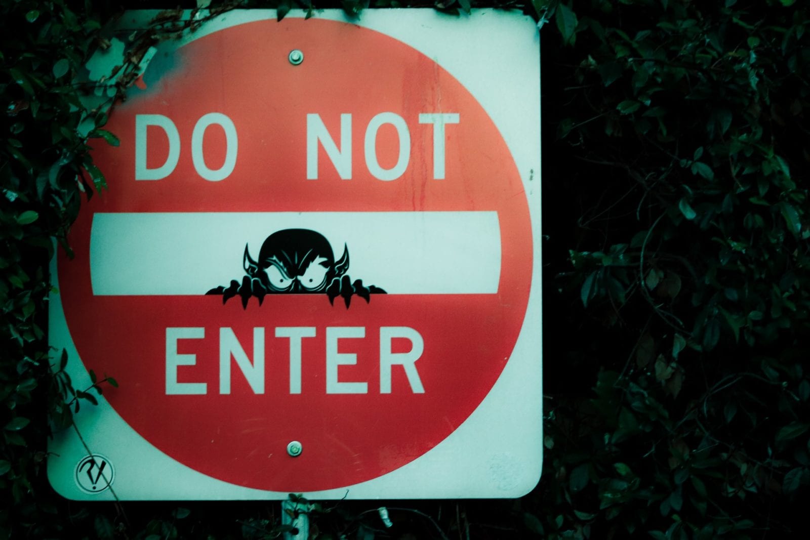
Poor Site Navigation
Good site navigation always has the customer in mind. As well as helping people easily find their way around your site, it should also offer a way to retain visitors, keep them engaged and drive them through the conversion funnel.
Even if the rest of your site is perfect, if a customer can’t find what they’re looking for, they’ll be left confused and you won’t get the conversion you want either.
Is your site starting to feel more like a maze? Maybe it’s time to introduce a Minotaur.
Typography Mistakes
The fonts you use for your website should be easy to read and helps with customers scanning your content.
Unclear fonts include cursive, hand-drawn scripts and symbols which are hard to read. It can also be too much or too little spacing between characters.
Beware of using too many fonts on your site! This can be distracting to your audience when their attention should be focused on your content’s message.
If your font resembles a language invented by H.P. Lovecraft, you’re probably using the wrong type.

Clashing Colours
Contrasting (or complementary) colours are situated opposite each other on the colour wheel. There’s a time and a place to use them within web design.
They are effective at highlighting content which requires attention. But looks unprofessional and can drive customers away if overused within your design.
If your site has an older intended target audience, or your business is trying to communicate a serious message, we recommend steering clear of clashing colours.
As with fonts, don’t use too many colours or you will distract and confuse your audience.
Too many clashing colours is a sure way to leave your site looking like Frankenstein’s Monster!
Poor Content
Content is king. So you can really let your site and business down by delivering poor content to your customers.
There are many ways you can go wrong with your content. Poor grammar, too much jargon, inappropriate format, irrelevant messaging, forgetting to include a Call To Action… The list goes on!
At Think Zap, we believe that great content focuses on much more than selling. It is engaging, passionate and focuses on building a relationship with your customers.
Don’t bore your customers to death with your site’s content – they may come back to haunt you!
Too Many Pop-Ups
Pop-ups can be a useful marketing strategy because they demand attention, focus on one message and have been shown to improve conversion rates.
But too many pop-ups are annoying as hell.
If you’re using pop-ups to block access to your content, you risk people spending less time on your site, or leaving it almost immediately after arriving. Intrusive pop-ups can damage your site’s ranking on search engines, and they aren’t great for mobile users either.
Has your site got more pop-ups than zombies in a zombie apocalypse movie? It’s time to start rethinking your marketing strategy!
Do any of these “sins” apply to your website? Maybe it’s time for a redesign… Get in touch with Team Zap to learn more about how we can help.