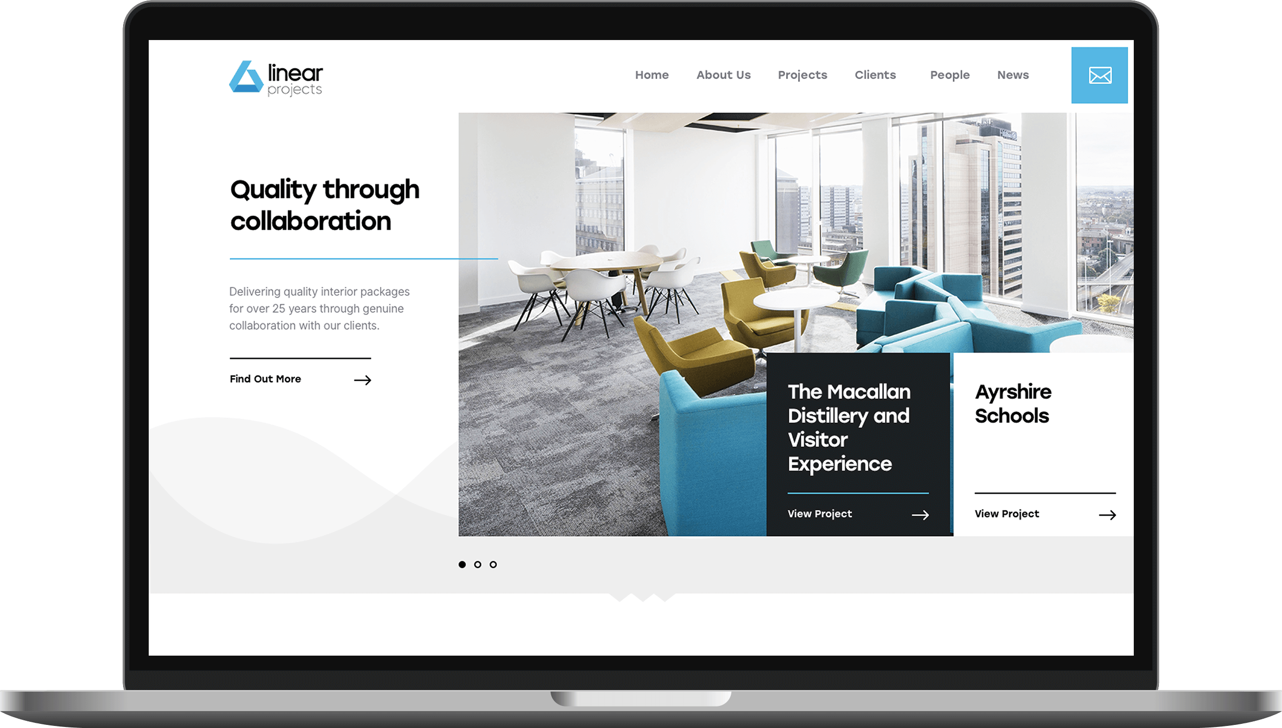

Rebrand the business into two brands and match the new website with the clients high standards of attention to detail.
Think Zap were tasked to take their old outdated brand and create something modern which can be used for other areas of the business. They also needed a presentation folder which can be flexible to use for different sectors.
With their company name being Linear, their last triangle shaped logo didn’t showcase this at all. We set out making sure we could do that and more. We used one colour so we could do the same for other brands of the business.
We wanted to take the Linear meaning to a whole new level and we designed and built a website with multiple content blocks from a timeline to showcase the company’s 25 year history and picture blocks where lines connect the pieces together. This project shows you why getting amazing photography for your projects can go a long way to creating a visually amazing website.