Don’t underestimate the importance of colour for your website’s design and brand! When people land on your website, visual appearance and colour will form a major part of their initial decision-making.
Research shows that 62 – 90% of snap purchase decisions are based on colour alone. Colour also increases brand recognition by up to 80% (source: University of Loyola, Maryland study). This means that people are likely to recall brands from their chosen colours.
Choosing the right colour scheme for your website can be intimidating. Which colours best reflect your brand? What colour combinations work well together? How much colour should you use on your site and where?
The good news is that most modern, well-designed websites follow a similar pattern for choosing its main colours. Here’s what we recommend when choosing a colour scheme for your website and brand…
Choose a dominant colour.
This will always be your brand colour. The colour you want your audience to remember you by.
You’ll also want to think about the emotions you want people to feel when they arrive on your site. This is known as Colour Psychology, a field of thought which also explores how colours can influence our perceptions and the assumptions we make.
Here’s an infographic of common colours and their associated meanings…
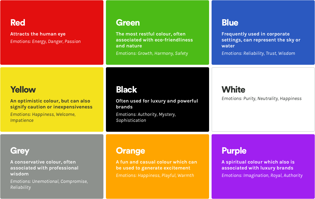
A more extensive list of colour meanings and symbolism can be found here.
Studies show that colour can affect our mood, sleep, heart rate, and well-being. This makes Colour Psychology a helpful starting point for choosing your brand colour. But it isn’t an exact science!
Be aware that people’s perception of colours can vary across cultures, as well as ages, gender identity and a multitude of other factors. Your audience will also take meaning from other cues on your website, such as any messages implied or communicated by photos, audio and text. To learn more about how these elements work and interact with each other, check out the Open University’s free short course on Designing the user interface.

Choose your accent colours.
These colours will breathe life into your website. You will use them to highlight the areas which need your audience’s attention, such as buttons, headings or quotes.
A free tool we recommend for creating your website’s colour palette is Adobe CC’s Colour Wheel.
It’s also useful to know the four main colour schemes (also known as colour harmonies) frequently used by web designers. Your choice of colour scheme will affect the look and feel of your website. These colour schemes are…
Monochromatic
This is the most basic colour scheme, using only a single colour with various tints and shades. It is perfect for websites which require a clean and simple design. Grayscale websites follow the same rules, but instead of a single colour, they only use black and white.
Complementary
This colour scheme uses colours from opposite ends of the colour wheel. Think blue and orange, red and green, or yellow and purple. It creates designs that offer a dramatic display of colour and grabs your attention. If used incorrectly, clashing colours can look unprofessional and distract the audience. Another option would be to try Compound, which combines the lightest and darkest version of a single colour.
Analogous
This colour scheme combines three or more colours adjacent to each other on the colour wheel. An example is blue, green and teal. Usually one colour will be used as the dominant (your brand) colour, with the second supporting and a third as an accent. It works best for calming and visually appealing displays, but should not be used for content which requires attention.
Triadic
This colour scheme uses three colours which are equidistant from each other on the colour wheel. These colours will either be or derive from red, yellow and blue. Designs using this colour scheme will have a sense of equality, vibrancy and security.
To learn more about colour theory and combining colours, check out this video on Colour Theory Basics.
Choose a background colour.
It’s best practice to choose something neutral as your website’s background colour. You don’t want to distract the audience’s attention from your website’s content with vibrant and clashing colours.
Most website designs will avoid colour for backgrounds, except to make a small block of text more eye-catching. White – or an off-white colour – is most frequently used for websites.
Another advantage to choosing a neutral colour is accessibility. Colour Accessibility focuses on people with visual impairments or colour vision deficiencies. Being aware of their needs can improve your website’s usability. A helpful guide to Colour Accessibility is available here.
Hire a designer.
There’s many tools and guides out there which will help you choose a colour scheme for your website, but the best results can still only be delivered by a professional designer.
Not only will it save you time and hassle, allowing you to focus on other important areas of your business, the services of an experienced designer is worth every penny. They can bring your vision to life, translating it into a high quality, fully responsive and customisable design.
But don’t just take our word for it… You can see for yourself what to expect from a professionally designed website here.